
Tell me about Svenja. Where are you? Where did you grow up?
Originally hailing from Hamburg, I now call Neukölln my home, a lively and diverse quarter in the south of Berlin. As a fellow Neuköllner put it: “Neukölln hands me a beer, when I need it and sometimes yells at me, when I don’t need it. I think that’s fair.” Accurately spoken. On the whole I like the daily hustle and bustle, but it’s vital for me to get out of there every once in a while to one of Brandenburg’s many lakes to clear the head!
I grew up in the suburbs of Hamburg and continued to live close to my family until I was in my mid-twenties. However, I don’t feel a particular connection to that city, except to my family home, so I chose to go where I gravitated towards.
How did Poster Women come about?
I became interested in feminism, naturally I’d say, growing up a woman in a patriarchal society. I joined groups and a reading circle and volunteered at a shelter for female/trans prostitutes and drug-addicted women*. I guess one can say I have been channeling my inner power towards becoming an activist for women’s interests. It struck me last year, that—in the midst of all the debate—there were still so many male-dominated design conferences and committees within the design scene, especially in Europe. Particularly poster design is made to be such a boys club, which is total BS. I wanted to prove that women* are and always have been exceptional creators and designers!
Image c/o Bea Rodrigues
Let’s start with some context… can you talk us through some standout posters
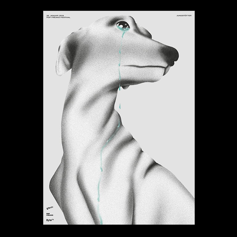
Crying Dog by Kahyan Mac for singer/songwriter Jungstötter
This must be one of my favorite posters of all time. While the tears speak to me instantaneously, the poster reveals its crafts“woman”ship on a second glance, from the perfectly executed illustration, to the unobstrusive typography. Kahyan achieved the perfect visual metaphor for Jungstötter’s melancholic vibes.

Girls From Today by somos
A naked women’s buttocks on a feminist poster account?, one might ask. Or not, because everything about this poster is right on point! It announces the launch of the fanzine by “Girls From Today” dealing with feminism, friendship and heartbreaks by photographer Andrea Savall. Madrid-based design duo somos® uses Savall’s photography in a way that deconstructs our individual preconceptions about how women’s bodies should be portrayed. Over the course of centuries the woman’s body has been made out to be something shameful—here instead, there’s no shame, just joy and pride.
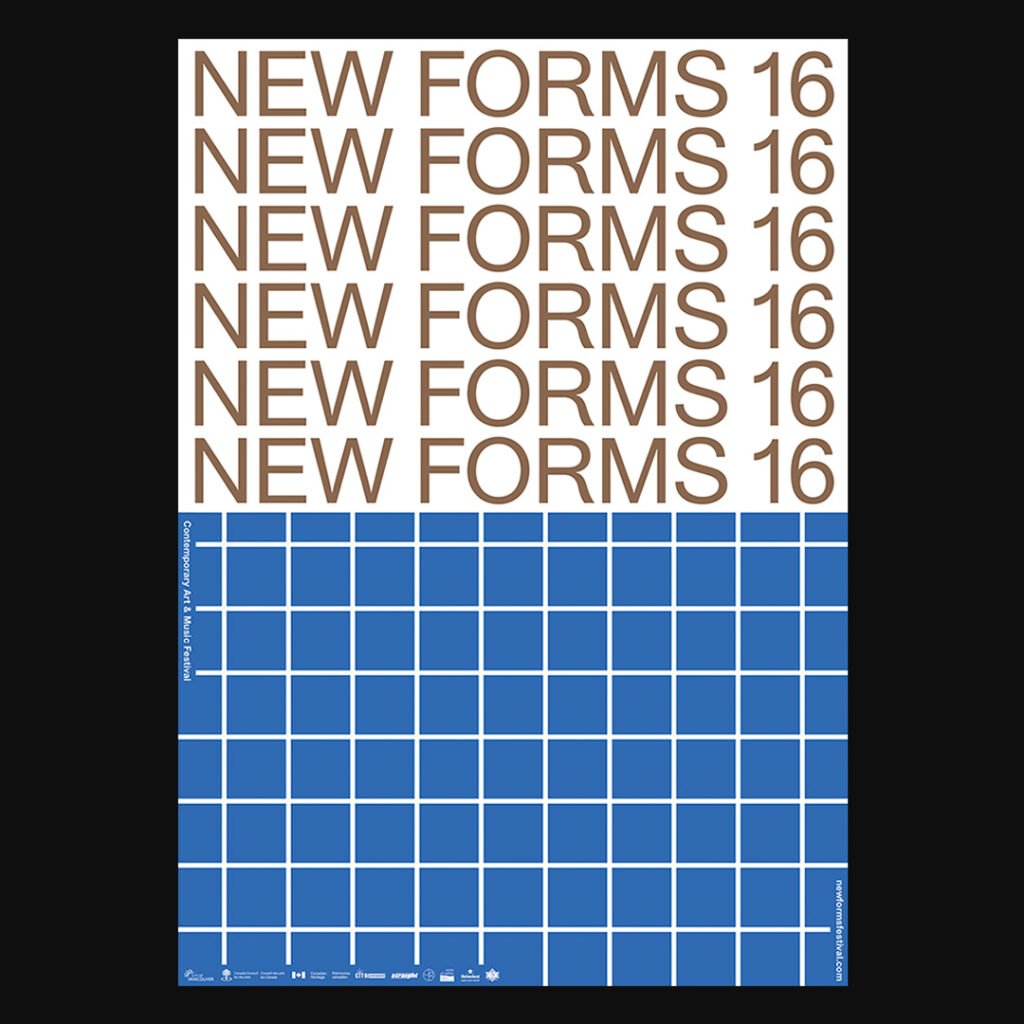
New Forms by Sandra Doeller
This poster is part of the visual system for the 2016 New Forms Festival in Vancouver, run by the New Forms Media Society, a non-profit society and media arts organization, to nurture and connect local and international artists, thinkers, practitioners, and the public. I love me a good formal approach, but Sandra takes it further. The individual posters seamlessly go together creating an oscillating surface of white, red, blue and gold patterns.
What else are you working on?
As an independent graphic designer and illustrator I am currently in the process of founding my own studio for visual communication together with my colleague and friend Annika. Additionally I’m helping at Retune, a lab for creative technology, as social media and communication manager, because I’m a Mailchimp and Instagram whiz and I love to write about art and design. Behind the scenes of Posterwomxn, I’m working on a business model to expand the project and make it more sustainable.
Can you share any of your plans to become more sustainable business-wise?
On one hand, I aim to build a creative partnership with a company, that wants to support the content creation and growth of the newsletter. I think it has huge potential, and I love the fact that the interviews are subscription-based.
There’s a certain value about being granted this access to someone’s personal mailbox, because it is a direct way of communication, unlike a blog or social media.
One the other hand, I’d like to build a supporter program for Posterwomxn, for me to be able to organize more and better funded collaborations. This is what I will be working on next.
I love your lo-tech approach to Poster Women – Instagram, Linktree, a shared Google Sheet and a MailChimp account. How would you describe your approach to creating?
This project challenges me to be more pragmatic. My work for Posterwomxn is still entirely unpaid, so I always have to figure out ways to develop and grow it without spending fortunes. I’m designing and managing all of it by myself, which means that often I have to compromise and be inventive and that I’m making mistakes constantly. This is particularly hard for me as I tend to be the stereotypical perfectionist designer, but I’m learning to not be so rigorous and softer on myself and take the lessons as they come.
What is it about the poster format that makes it so powerful?
I believe that its power lies within the possibilities for experimentation and its accessibility. A book or an ebook, for instance, will be kept in a library and is usually not on display. A poster is made for the public, for visibilty. This can be as restrictive as it can be inspiring, and this tension is what makes the medium so interesting to work with. That being said, it’s only as powerful as its immediate aesthetic impact.
Where do posters fit into the modern design world, so heavily dominated by digital?
It is a question of how you define the medium. Due to the many technological advances, be it Augmented Reality or tangible mobile interactions, the contemporary poster represents itself in many shapes and formats. The current collaboration SDW x Posterwomxn, a month-long residency at the screen printing workshop SDW Berlin, deals with this topic of “Poster: what matter/s?”
Can a poster be digital only? How tangible does it have to be? or, is it a question of accessibility?
However, I think the love for print prevails, and there’ll always be an appreciation for the poster as printed matter. At least for someone who lives in Berlin, I can say this is as obvious as ever.
What else can the design community do to promote diversity, aside from showcasing great work?
If you see inequality, you address it, especially when you have a platform, a position of infuence, and even moreso when noone else speaks up. The design world can be such an elbow society, people are scared of being excluded when it comes to attacking the status quo, but that fear gets us nowhere.
At the moment, a great deal of the feminist energy and achievements is a woman’s* work. Men have to become a more active part in the discussion and position themselves in the evolving climate. This is already happening and it’s great!
What have you done so far to build the Posterwomxn community and newsletter? What worked? What didn’t?
I was expecting more interest in the newsletter when I first started to publish it the beginning of the year, given that I had built a community on Instagram now exceeding 3,500 followers. I quickly learnt that email is a wholly different commitment, which made me care even more about email. Instagram is a great communication channel, which I will continue to use, but it is ever-important not to be dependent on it. Thus, I’m satisfied that I’m already working on decentralizing Posterwomxn.
However, the accessibility of the Instagram platform helped me to kick off the project in the first place. From then on, there’s nothing else than to keep at it. No magic here. Sunday nights I sit down to curate the week’s posters and write captions. The stream of publication gives life to the channel and stimulates its organic growth.
I’m obsessed with other peoples’ process – how does The Posterwomxn Letter come together? What’s your workflow? What tools do you use? Who else is involved?
As you already accurately described, I have quite a low-tech approach. The most important is that I have access to all important files on both my iPhone and MacBook. After I sat down for an interview via Skype, which I record using good ol’ voice memo on iPhone, I transcribe the interview in Notes. I find that the transcription process is easier and faster on the phone, and I can quickly skip back and forth through the interview that I listen to. I usually do this when I commute. A few days later I will sit down to reread, edit, and filter out the most interesting parts. Usually this gives me an idea of the overall theme and along that I find a narrative. Finally, it all comes together when I import the copy and images into my Mailchimp layout. I usually send a few test e-mails to proof-read and check links, but that’s all.
The headers are provided by my friend Inga Plönnigs, who designed the “Magnet Poster” typeface that I use for Posterwomxn’s logo and headlines. It hasn’t been published yet, so I have the exclusive priviledge to use this beautiful typeface!
What big idea would you love to work on if you had unlimited time and money?
Not one big idea, but many small ones. I would ask people for lunch on a daily basis to pick their brains about their work. Of course, I will gift them my time, so they can make space for that in their busy schedules. 🙂